Data visualization is a pictorial or graphical format of the presentation of data. This graphical representation helps decision makers to see analytics presented visually. So, they can get difficult concepts and identify new patterns easily form the data.
Content Overview
On the other way interactive data visualization helps to drill down into charts and graphs to get more details and finding insights very easily. Actually, visualization delivers fast answers to your complex questions from data.
“The great value of a picture is when it forces us to notice what we never expected to see” — John W. Tukey
Matplotlib
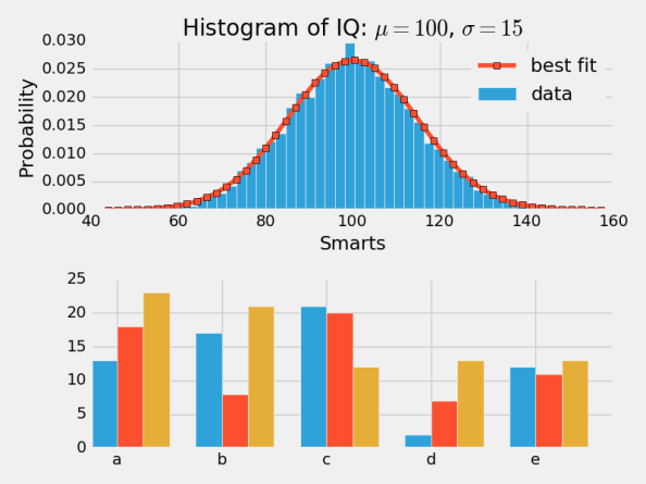
Matplotlib is a Python Library used for the generation of simple and powerful visualizations. It is for plotting vast variety of graphs, starting from histograms to line plots to heat plots. It is an excellent tool which is helping Python (with some help of NumPy, SciPy, and Pandas) to compete with scientific tools as MatLab or Mathematica.
You can make just any visualizations you like;
- Scatter plots;
- Bar charts and Histograms;
- Line plots;
- Pie charts;
- Stem plots;
- Contour plots;
- Quiver plots;
- Spectrograms.
Basically, everything is customizable and you can create labels, legends, grids etc. with ease.
Seaborn
Seaborn is mostly used for the visualization of statistical models. It is based on Matplotlib and highly dependent on that. Seaborn’s default styles and color palettes are the key difference with matplotlib. It is designed to be more aesthetically pleasing and modern with a few lines of code. As I told Seaborn is built on top of matplotlib, you’ll need to know matplotlib to tweak Seaborn’s defaults.

Bokeh
Bokeh is another awesome visualization library in python. It aimed at interactive visualizations. And it is independent of Matplotlib. As I already mentioned, it is a Python interactive visualization library that targets modern web browsers for presentation. It helps user to quickly and easily create interactive plots, dashboards, and data applications.

Plotly
Plotly is a web-based toolkit for building visualizations, exposing APIs to some programming languages (Python among them). It lets users easily create interactive charts and dashboards to share online with their audience.
There are a number of robust, beautiful graphs on the plot.ly. If you want to use Plotly, you need to set up a API key. The graphics will be processed server side and will be posted on the internet.

Pygal
Like Bokeh and Plotly, pygal also popular for interactive plots. These interactive plots can be embedded in the web browser easily. Its primary difference is its ability to output charts as SVGs.
