Data Basics: Plotting – Charts and Graphs
Plotting is a data visualization technique used to present data in a graphical form. It involves creating charts, graphs, and other visual representations of data to help people understand the data and the patterns and trends it contains.
So far we have explored the data little bit and we got to know about the summary statistics, central tendency and measures of spread of the data. Now, proper visualization can help to do further analysis.
Four methods of visualizing data are often used.
- Line plots: Used to show trends over time, often used for time series data.
- Scatter plots: Used to show the relationship between two variables.
- Bar plots: Used to compare different categories or groups.
- Histograms: Used to show the distribution of a single variable.
- Box plots: Used to show the distribution of a variable and any outliers.
-
Heatmaps: Used to show the relationship between two variables with color-coded cells.
For this section I will work with mtcars data set which is a built-in data set in R. You can get the help file by just typing ?mtcars. To load the datasets just use the following code.
?mtacars
library(datasets)
#OR
data("mtcars")
Histograms in R
When visualizing a single numerical variable, a histogram will be our go-to tool, which can be created in R using the hist() function
hist(mtcars$mpg)

hist(
mtcars$mpg,
xlab = "Miles/gallon",
main = "Histogram of MPG (mtcars)",
breaks = 12,
col = "lightseagreen",
border = "darkorange"
)

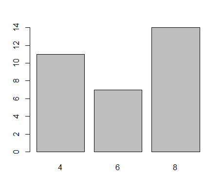
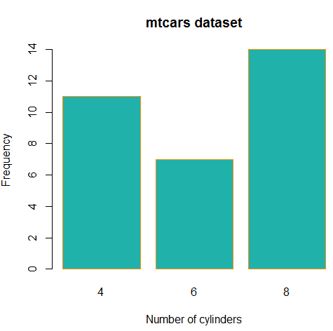
Barplots in R
A barplot can provide a visual summary of a categorical variable, or a numeric variable with a finite number of values, like a ranking from 1 to 10. For drawing barplot I will use cyl varible which is nothing but Number of cylinders in mtcars dataset.
barplot(table(mtcars$cyl))
barplot(
table(mtcars$cyl), # The data to be plotted on the bar plot
xlab = "Number of cylinders", # The label for the x-axis
ylab = "Frequency", # The label for the y-axis
main = "mtcars dataset", # The title of the plot
col = "lightseagreen", # The color of the bars
border = "darkorange" # The color of the border around the bars
)
Boxplots in R
we can use a single boxplot as an alternative to a histogram for visualizing a single numerical variable. Let’s do a boxplot for Weight column in mtcars.
boxplot(mtcars$wt)

To visualize the relationship between a numerical and categorical variable, we can use a boxplot. Here mpg is a numerical variable and Number of cylinders is categorical.
boxplot(mpg ~ cyl , data = mtcars)
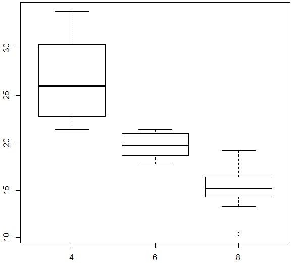
You can make the box plot more attractive by setting some of its parameters.
boxplot(mpg ~ cyl, data = mtcars,
xlab = "Number of cylinders",
ylab = "Miles/(US) gallon",
main = "Number of cylinders VS Miles/(US) gallon",
pch = 20,
cex = 2,
col = "lightseagreen",
border = "red")

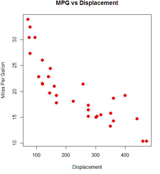
Scatterplots in R
To visualize the relationship between two numeric variables we will use a scatterplot. This can be done with the plot() function and the ~ syntax we just used with a boxplot.
plot(mpg~disp, data=mtcars)

You can use the above graph more beautiful by using the below code.
plot(mpg ~ disp, data = mtcars,
xlab = "Displacement",
ylab = "Miles Per Gallon",
main = "MPG vs Displacement",
pch = 20,
cex = 2,
col = "red")