Data Visualization Using R
Data visualization is the presentation of data in a pictorial or graphical format. It enables decision makers to see analytics presented visually, so they can grasp difficult concepts or identify new patterns.
Four methods of visualizing data are often used.
- Histograms
- Barplots
- Boxplots
- Scatterplots
For this section I will work with mtcars data set which is a built-in data set in R. You can get the help file by just typing ?mtcars. To load the datasets just use the following code.![]()
?mtacars
library(datasets)
#OR
data("mtcars")
Histograms:
When visualizing a single numerical variable, a histogram will be our go-to tool, which can be created in R using the hist() function
hist(mtcars$mpg)

hist(mtcars$mpg, xlab = "Miles/gallon", main = "Histogram of MPG (mtcars)", breaks = 12, col = "lightseagreen", border = "darkorange")

To know more about the arguments that a histogram can take check this link.
https://stat.ethz.ch/R-manual/R-devel/library/graphics/html/hist.html
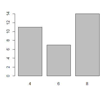
Barplots:
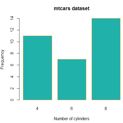
A barplot can provide a visual summary of a categorical variable, or a numeric variable with a finite number of values, like a ranking from 1 to 10. For drawing barplot I will use cyl varible which is nothing but Number of cylinders in mtcars dataset.![]()
barplot(table(mtcars$cyl))
barplot(table(mtcars$cyl), xlab = "Number of cylinders", ylab = "Frequency", main = "mtcars dataset", col = "lightseagreen", border = "darkorange")
To know more about the arguments that a barplot can take check this link.
https://stat.ethz.ch/R-manual/R-devel/library/graphics/html/hist.html
Boxplots:
we can use a single boxplot as an alternative to a histogram for visualizing a single numerical variable. Let’s do a boxplot for Weight column in mtcars.![]()
boxplot(mtcars$wt)

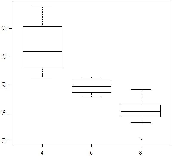
To visualize the relationship between a numerical and categorical variable, we can use a boxplot. Here mpg is a numerical variable and Number of cylinders is categorical.
boxplot(mpg ~ cyl , data = mtcars)
You can make the box plot more attractive by setting some of its parameters.
boxplot(mpg ~ cyl, data = mtcars,
xlab = "Number of cylinders",
ylab = "Miles/(US) gallon",
main = "Number of cylinders VS Miles/(US) gallon",
pch = 20,
cex = 2,
col = "lightseagreen",
border = "red")

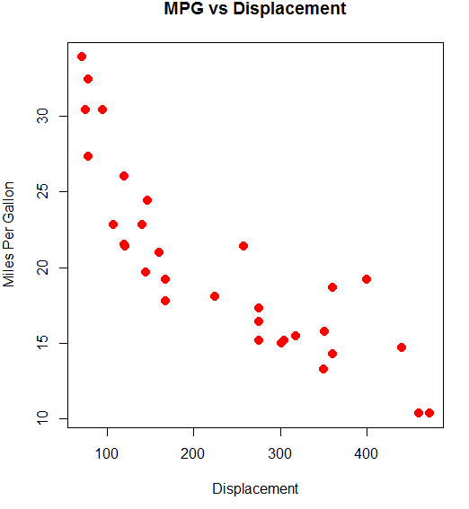
Scatterplots:
To visualize the relationship between two numeric variables we will use a scatterplot. This can be done with the plot() function and the ~ syntax we just used with a boxplot.![]()
plot(mpg~disp, data=mtcars)

You can use the above graph more beautiful by using the below code.
plot(mpg ~ disp, data = mtcars,
xlab = "Displacement",
ylab = "Miles Per Gallon",
main = "MPG vs Displacement",
pch = 20,
cex = 2,
col = "red")