Explore your Data: Graphs and shapes of distributions
Shapes of Distributions: Definitions, Examples
The shape of a distribution, or the way in which the data is spread out, is determined by a combination of its central tendency, variability, and skewness.
Central Tendency
The central tendency of a distribution refers to where the data cluster around. The most common measures of central tendency are mean, median, and mode. The choice of measure can affect the shape of the distribution. For example, a distribution with a long tail to one side might have a mean that is different from the median, which is a measure of the central value.
Variability
The variability of a distribution refers to how spread out the data are. One way to measure variability is by calculating the range, which is the difference between the highest and lowest values. Another way is by calculating the standard deviation, which measures the spread of the data around the mean.
Skewness
Skewness refers to the degree of asymmetry in a distribution. A distribution that is skewed to the left has a tail that extends to the left, while a distribution that is skewed to the right has a tail that extends to the right. If a distribution is symmetric, it has zero skewness.
As a data set is plotted, it can generate various shapes among dozens of possibilities, each representing a different distribution. Examining the shape of the distribution can provide a visual representation that illustrates how the data is distributed.
For Categorical Variables:
If variable of interest is categorical then generally Pie chart or Bar Graph is the best representation.
If too many categories are there then pie chart might be messy but Bar Graph will give a clear view. So, Bar Graph is having advantage over Pie Chart when no of variables are too high.

For the above table if we draw pie chart for percentage column it will be like this.

For the same table if we draw bar graph for percentage column it will be like this.

Basically, for categorical variable you can do these many representations listed below.
- Bar plot
- Pie Chart
- Frequency Table
- Contingency Table
- Segmented Bar Plot.
- Relative Frequency
- Mosaic Plot
- Side by Side Box Plot
For Quantitative Variables:
Dot Plot:
If you are working with quantitative variables or numerical variable then Dot Plot is one kind of representation that can be used. A dot plot looks like this. Plot each and every point into the graphs after drawing a horizontal line and label the possible values on it, in regular intervals.
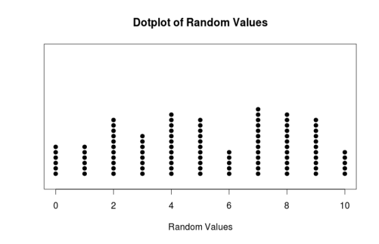
But If you have a very large sample then dot plot may looks messy.
So, another kind of representation called Histogram might be useful for that case.
Histogram:
A histogram is similar to a bar graph in the sense that it uses bars to portray the frequencies or relative frequencies of the possible values of a variable. However, there is one important difference. That difference is that the bars in a histogram touch each other. This touching represents that the values of an interval/ratio variable represent an underlying continuous scale. Below is an example of Histogram.

Observe the above histogram and see the distribution. There are three kind of shapes.
- Middle one has the shape of a bell curve, has one peak, and is approximately symmetric.
- Left one is left skewed and unimodal
- Right one is right skewed and unimodal
Four kind of modalities are there
- Unimodal: It has only one peak
- Bimodal: It has two peak
- Multimodal: It has many peak
- Uniform: All are distributed uniformly

Whenever working with any data don’t forget to observe shape of a distribution. As it has essential importance because it could affect the statistical methods you are going to employ later.
In summary, the shape of a distribution is determined by the combination of its central tendency, variability, and skewness. Different measures of central tendency and variability, as well as different degrees of skewness, can produce a wide range of distribution shapes.